SOLHUN
Every screen fans out into the app, mobile web, desktop web, teacher web and admin web. Matching screens with the designer and the client was a bigger job than the code itself, so together with the designer I rebuilt the feedback process that kept losing items when requests were vague or piled up.
Design engineering

What changed
- 01
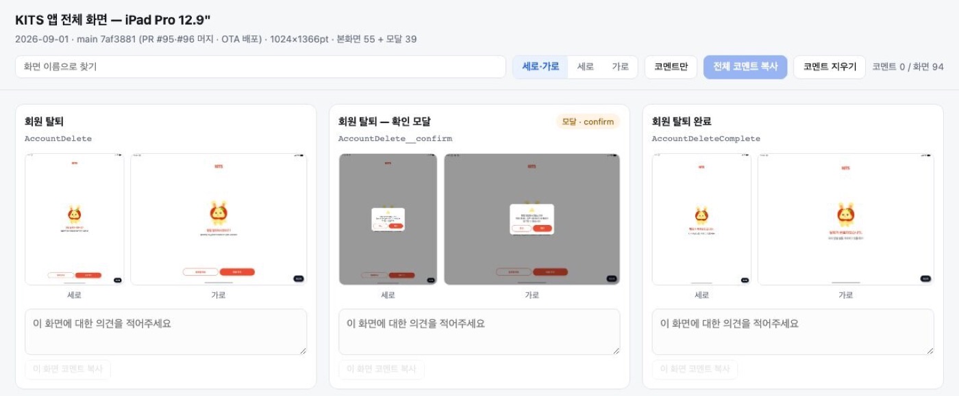
Responsive review
BeforeDragging the Chrome window wider and narrower, one screen at a time
AfterA review board showing 55 screens and 39 modals in portrait and landscape at once. Each screen has a comment box, so a designer’s comment becomes a work instruction as is.
55 / 55tablet screens checked · 0 errors
- 02
Sending feedback
BeforeSixty text notes in a single Slack message
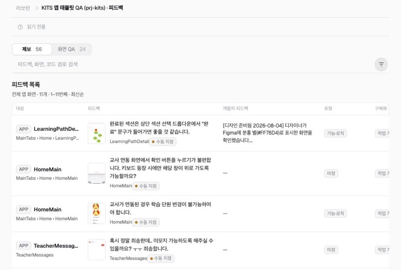
AfterA widget that lets you point at the actual button or text on screen and report it, added to all four apps: app, web, teacher and admin.
41reports the designer filed in a single day
- 03
Tracking progress
BeforeA 613-line review doc updated by hand; you had to ask to know what was fixed
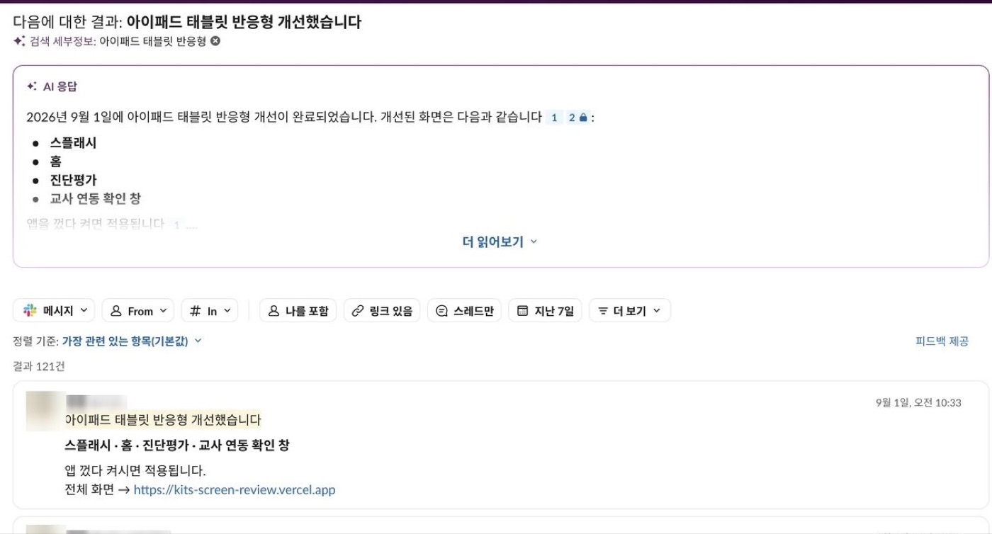
AfterReport → internal system → Linear issue → Slack notice, all automatic. When a fix ships, Slack gets what changed plus a link to the review board.
301+reports with a tracked status
Results
41 → 22of 41 reports on a busy day, 22 closed within 3 hours
94+screens reviewed together on one board
What people said
We could see that a lot has improved since the first round of feedback. This time there was much less to point out, and it was easy to keep track of everything.
We’ve never worked with a vendor like this.
Screens